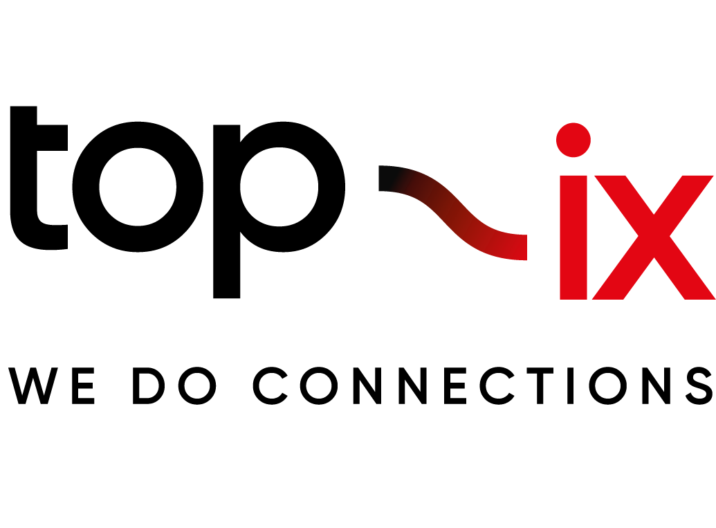
The new logo designed for TOP-IX by Quattrolinee agency was presented on December 4th, during the annual meeting dedicated to the consortium members and partners.
The rigid characters used in the previous logo are replaced with a light and round font to enhance readability.
The name, which maintains its positioning on two different levels, is held together by a line that becomes a distinctive element; a graphical representation of the connection between two elements; a reference to infrastructure and wiring, to what creates connection between structures, people and ideas.
The colors characterizing the Consortium are maintained and a shade is added, which makes the passage of color less clear but equally continuous, symbol of a search for continuous evolution and improvement.
TOrino Piedmont Internet eXchange – gives way to a claim that emphasizes the role of the consortium within the local and international market: We Do Connections.
And in parallel with the renewal of the logo, the office wall was also renewed: Corn79 created the mural with the new graphic design of the Consortium.
